Logo
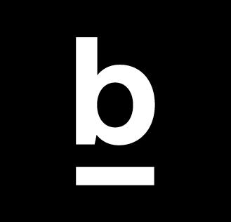
Our new word-picture sign is one thing above all: clear. Like a stamp, it puts our name in the centre.
Reduced use: The logo is the most important visual element of our identity. We use it purposefully and consciously, i.e. not every document is published with a logo.
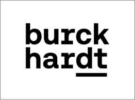
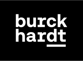
Versions
There are two color versions of the Burckhardt logo: a black version for light backgrounds, and a white version for dark backgrounds.
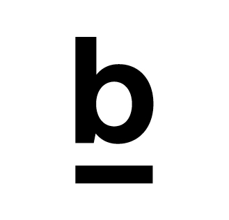
Icon
The short form of the logo can be used on very small formats. For example, as a website favicon or as profile images on social media platforms.
Notation
Burckhardt is always written in texts with a capital «B»: Burckhardt.
See applications.
Short form of the logo
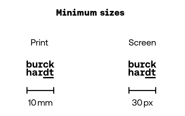
Sizes
Logo versions are available for both print and digital applications. All logo versions are also available as vector files (eps) and so can be scaled to the desired size without any loss of quality. The defined minimum size should always be observed.
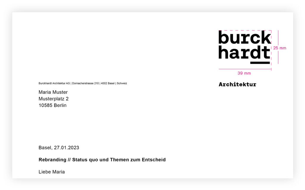
Templates with fixed logo sizes have been defined for individual media such
as letterheads.
Exclusion zone
No other graphical or distracting element may be placed in the exclusion zone surrounding the logo.
The exclusion zone is derived from the «c» of the logo.

Backgrounds
On white/offwhite
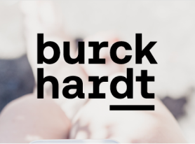
If the background is white, offwhite or generally light, the black logo is used.
Black logo on light or offwhite background
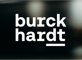
On black / dark background
On black or dark backgrounds, the white logo is used.
On images
When using the logo with an image as a background, the principle is to aim for the greatest possible contrast.
In other words, the black logo is used on light images and the white one on dark ones. In addition, when choosing an image, it is important to ensure that the logo is placed on a quiet part of the image that offers as large an area as possible.
Other topics
Colors

Graphics
Line