Linie
Line
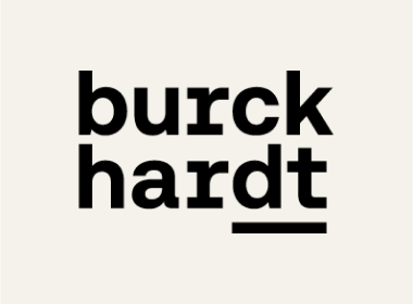
The line is a defining design element
of Burckhardt’s corporate design. Derived from the logo, it is used in two cases: as a red underline for emphasis and as a black dividing line to mark boundaries.
Underlining
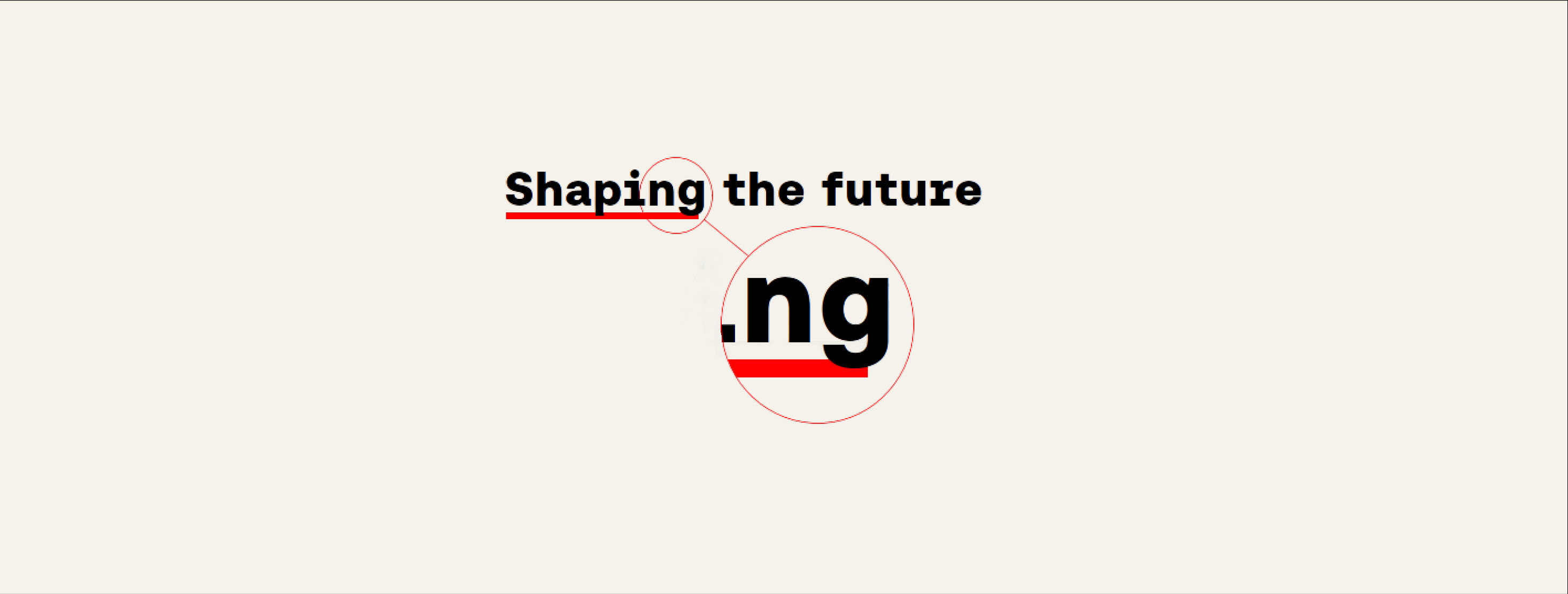
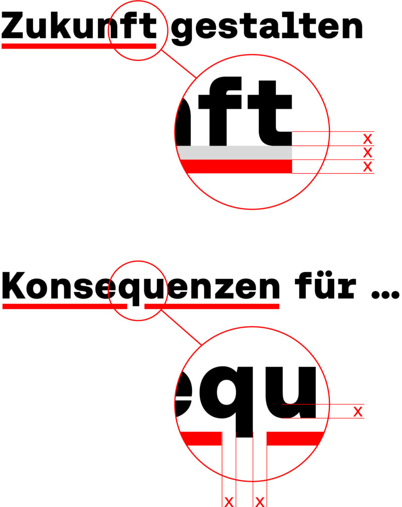
To highlight individual words or groups of words within headings or quotations, these can be underlined in red. The thickness of the horizontal line of the headline font serves as the benchmark for the underlining. This line thickness defines both the thickness of the red line and the distance between the headline and the red line.
The red line breaks around descenders. The distance between the red line and the descender corresponds to the horizontal line thickness of the headline.
Dividing line
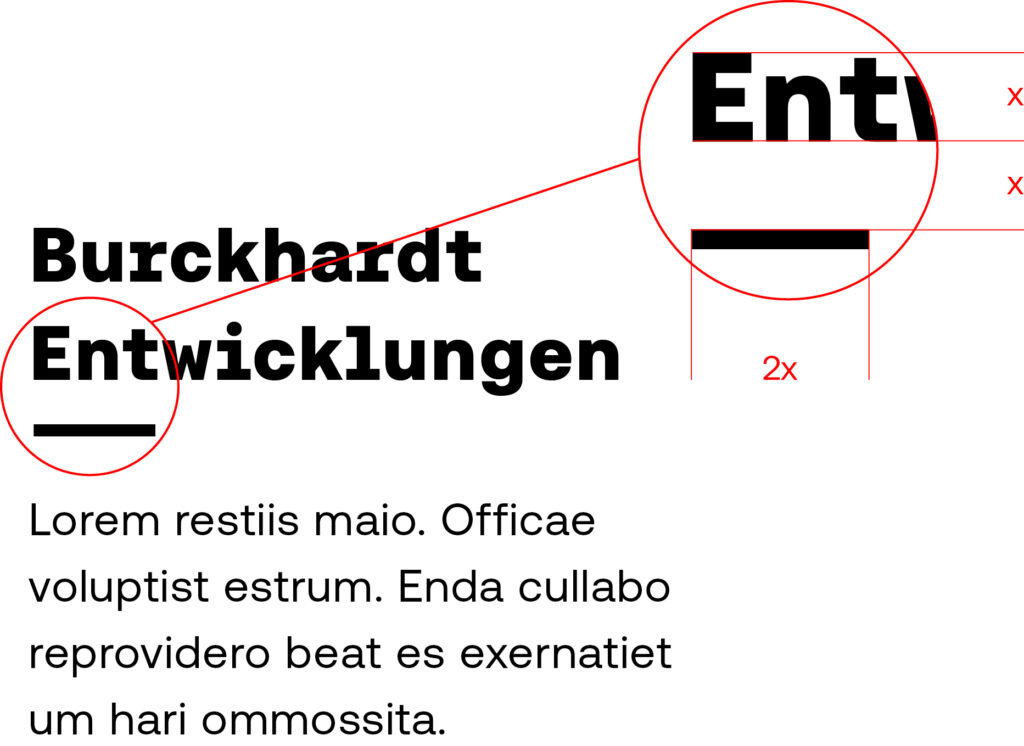
Lines are also used as a separating element between headlines and body text/introductory text. This makes the hierarchization clearer and picks up on the line in the logo in the design.
Since it is not used here as a highlighting but as a separating element, the distance between the headline and the line is greater than with the typographic highlighting. The distance is equivalent to the cap height of the headline. The length of the dividing line is twice the cap height.
The dividing line should not be used in the immediate vicinity of the logo to avoid duplication of the element.
Other topics
Logo
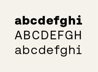
Typography
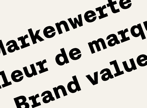
Brand values